Sponsored by the UK Department for Work and Pensions, MaPS was
established in 2019 as a new governmental organisation which would bring
together under its umbrella three major financial guidance bodies. Its
main purpose is to develop and co-ordinate a national strategy which
aims to improve people’s financial capabilities by providing
accessibility to the best financial services and knowledge available in
the UK.
As part of the new organisation branding I was responsible for designing the official logo and conceptualising the foundations for the visual identity which later been developed further.
As part of the new organisation branding I was responsible for designing the official logo and conceptualising the foundations for the visual identity which later been developed further.

The initial brand’s communication purpose at stage one was internal
(aimed at the employees who joined from the three financial bodies) and
official (aimed at third sector, governmental and policy making bodies), the strategy developed on the basis of three core messages that supported the new positioning of the organisation: Growth, Trust and Experts, depicted in the logo mark by a blue geometric ribbon that can expand, grow and direct while providing a sense of mission and togetherness.
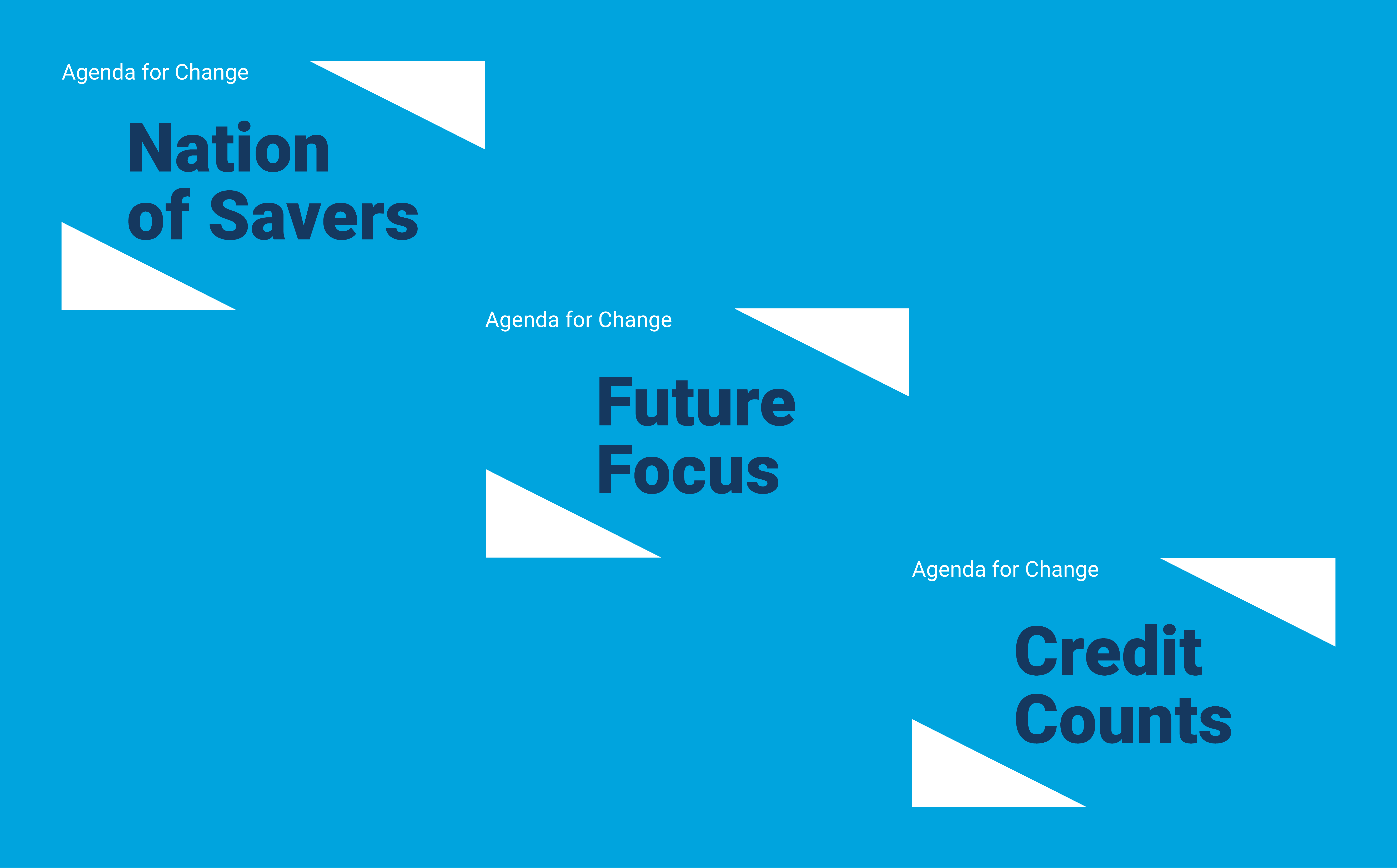
The logo mark 25 degrees square shape, is used as an identifiable and flexible graphic device that frames, directs and enhances the focus on the hero image and message.
The logo mark 25 degrees square shape, is used as an identifiable and flexible graphic device that frames, directs and enhances the focus on the hero image and message.


